Learning CSS #1: CSS Battles #1 Writeup
You might be asking yourself how did you get here? I know I’m sort of asking myself the same question: the TL;DR is I never stop learning, and right now I needed to learn some CSS for my job.
I’ve started learning CSS for real at work recently to be able to do full-stack E2E development. So far, CSS was a “hack it until it works” kind of thing for me, and I’ve never done it properly. I’m always up for a chance to learn things hands-on.
So there’s practical reasons for me to do CSS, but also, I’ve stumbled across Kevin Powell’s YouTube channel all about CSS. I watched the recent CSS battle video: It was super cool and I wanted to try it out for myself. If you’re into CSS I highly recommend you check Kevin’s content out. If you’re reading this, thanks Kevin!
⚠️ Spoilers ahead! I’ll post my solutions in full. If you want to play along while reading the post, you can click here to open the battle yourself. THIS WRITEUP WILL SPOIL THE CHALLENGE FOR YOU. So why am I writing it up?
- I want to be sure that I understood how I solved the level.
- I want to be sure that I can explain my solution to other people.
- If someone is stuck and wants some help to continue, they can do so quickly.
These challenges can be frustrating. While I think that a little frustration is good (especially in CTFs), I hope this guide will cause someone who was almost discouraged from trying/continuing the challenge to carry on. If you’re one of these people - don’t give up! You can do this 💪🏽

The battles are “code golf” style challenges ⛳️ where you have to write the smallest amount of code to achieve a certain goal. But I’m not going to focus on that - just on learning how to do things ‘properly’.
Target #1: Simple Square
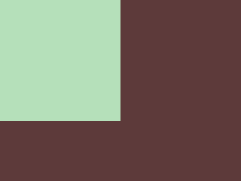
We started with the left side, and we need to get to the target on the right:

The first thing I did was change the background color of the square to the target. CSSBattle gives you the hex codes of the colors you need, but just for fun, I “mixed” the color I needed manually using the W3School color wheel:

To change the color, we named the div using class and then
changed the background CSS property of that class using the . selector:
<div class="square"></div>
<style>
  .square {
    background: #b5e0ba;
  }
</style>
Repeat with the body element:
body {
  background: #5d3a3a
}
Next we want to position the square in place. To do this I read the
documentation for the position property,
and wound up with this:
  .square {
    position: absolute;
    top: 0;
    left: 0;

Finally, to adjust the sizes, I used the width and height properties:
  .square {
    width: 200px;
    height: 200px;
The final result is:

And the code is:
<div class="square"></div>
<style>
  body {
    background: #5d3a3a;
  }
  .square {
    position: absolute;
    top: 0;
    left: 0;
    background: #b5e0ba;
    width: 200px;
    height: 200px;
  }
</style>
Target #2: Carrom

WTF is “Carrom”? A flicking board game, apparently. I’ve never heard of it, but it looks fun. Check out these people having the time of their lives playing it:

My thought process for this one was that drawing the actual shape(s) would be easy, but the difficult part is positioning them. Since the boxes are all in the “corners” of some “container”, I thought I’d start by drawing the container itself, then position the boxes inside it.
To work on the container, I used a CSS debugging trick I picked up from one of the frontend devs at work: add an debug outline (that will be removed later).
  .container {
    outline: 2px solid green;
Note: I’m using the
outlineproperty here instead ofborderbecause it’s mostly around for a11y reasons, and shouldn’t affect the real layout of what I’m working on.
Then, using the very cool “diff” feature of CSSBattle, I could see where to exactly position the container:

Then the boxes are easy:
  .box {
    background: #fdc57b;
    width: 50px;
    height: 50px
  }
Positioning them took some fiddling around with flex. I used a pretty good
reference: “A Complete Guide to Flexbox”
by CSS-TRICKS.
  .container {
    /* ... */
    display: flex;
    align-content: space-between;
    justify-content: space-between;
    flex-wrap: wrap;
    gap: 100px;
  }
The final result (before and after removing the debug outline) is neat. Check out the confetti effect when you submit your code 🎊

And the final code is:
<div class="container">
  <div class="box"></div>
  <div class="box"></div>
  <div class="box"></div>
  <div class="box"></div>
</div>
<style>
  body {
    background: #62374e
  }
  .container {
    position: absolute;
    left: 50px;
    top: 50px;
    width: 300px;
    height: 200px;
    display: flex;
    align-content: space-between;
    justify-content: space-between;
    flex-wrap: wrap;
    gap: 100px;
  }
  .box {
    background: #fdc57b;
    width: 50px;
    height: 50px
  }
</style>
Target #3: Push Button

We’ll skip what we already did, and let’s analyze the target:
- There’s a rectangle.
- “on top” of it (see “Understanding CSS z-index” to understand what that means) is a circle.
- On top of that, there are more circles.
All the elements are centered, so it should be pretty simple. I picked up a centering trick from Kevin’s video:
position: absolute;sets the position to absolute, so that the content is positioned relative to its first positioned (not static) ancestor.inset: 0;sets the top, right, bottom and left properties to 0.margin: auto;sets all the margins to auto, which ends up centering the element.
  .centered {
    position: absolute;
    inset: 0;
    margin: auto;
  }
Then I can add the centered class to all the elements I want to center.
Re-useability! DRY! Seems like CSS is real code, after all.

Anyways, back to the task at hand. Now I need to do the first circle. To do it,
I used the border-radius property, which is just one of these properties you
“pick up” when you develop some CSS in the “hacky” way. To do some reuse since
we have multiple circles, I created a circle class:
  .circle {
    border-radius: 100%;
    aspect-ratio: 1;
  }
Then I added the circle class to the first circle, and the centered class,
and a “c1” id for the unique values such as color and size:

Here’s the code:
<div class="rect centered"></div>
<div id="c1" class="circle centered"></div>
<style>
  body {
    background: #6592CF
  }

  .centered {
    position: absolute;
    inset: 0;
    margin: auto;
  }

  .rect {
    width: 300px;
    height: 150px;
    background: #243D83;
  }

  .circle {
    aspect-ratio: 1;
    border-radius: 100%;
  }

  #c1 {
    background: #6592CF;
    width: 250px;
  }
</style>
Then I could simple add the other circles:
<div id="c2" class="circle centered"></div>
<div id="c3" class="circle centered"></div>
And the classes:
  #c2 {
    background: #243D83;
    width: 150px;
  }

  #c3 {
    background: #EEB850;
    width: 50px;
  }
Got it! The final result is:

And here’s the code:
<div class="rect centered"></div>
<div id="c1" class="circle centered"></div>
<div id="c2" class="circle centered"></div>
<div id="c3" class="circle centered"></div>
<style>
  body {
    background: #6592CF
  }
  .centered {
    position: absolute;
    inset: 0;
    margin: auto;
  }
  .rect {
    width: 300px;
    height: 150px;
    background: #243D83;
  }
  .circle {
    aspect-ratio: 1;
    border-radius: 100%;
  }
  #c1 {
    background: #6592CF;
    width: 250px;
  }

  #c2 {
    background: #243D83;
    width: 150px;
  }

  #c3 {
    background: #EEB850;
    width: 50px;
  }
</style>
Target #4: Ups n Downs
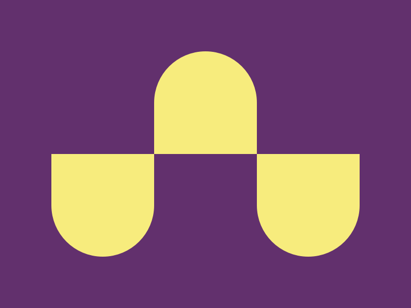
Looking at this, it looks like a 3x2 grid. I know there’s something like flex
called grid, so I started to read about it
in CSS-TRICKS.
Starting with the container div and with debugging, like before:

Then I added the 6 children divs, gave them a background color, and a border
radius. The trick here is using multiple values for the border-radius property
so the one part is rounded and the other is not:
  .up {
    border-radius: 100% 100% 0 0;
  }
  .down {
    border-radius: 0 0 100% 100%;
  }

Well, that’s not exactly what we want. 🙁 How does one set the grid’s layout? Turns out it’s super simple:
.container {
    display: grid;
    grid-template-columns: 1fr 1fr 1fr;
}
Done! While some of the things in the CSS battle are mostly useful for battles,
finally learning the difference between grid and flex is something I
wanted to figure out for a while now.

The code:
<div class="container">
  <div></div>
  <div class="light up"></div>
  <div></div>
  <div class="light down"></div>
  <div></div>
  <div class="light down"></div>
</div>
<style>
  body {
    background: #62306D;
  }
  .container {
    position: absolute;
    inset: 0;
    margin: auto;
    width: 300px;
    height: 200px;
    display: grid;
    grid-template-columns: 1fr 1fr 1fr;
  }
  .light {
    background: #F7EC7D;
  }
  .up {
    border-radius: 100% 100% 0 0;
  }
  .down {
    border-radius: 0 0 100% 100%;
  }
</style>
Target #5: Acid Rain
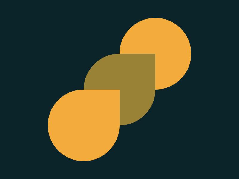
Hmm. Hmm… 🤔. There are 2 core issues to solve here:
- The positioning: we can use
position: absoluteinside something that’s positioned relatively. - The “drop” element: we can the
border-radiustrick again on 3 out of 4 corners.
The get the drops right was pretty easy:
  .drop {
    width: 120px;
    height: 120px;
    border-radius: 100% 0 100% 100%;
  }
But the positioning was harder. I did the “same old” trick of a lime debugging
container to find the right size. It’s centered so that part is easy. I thought
that to get a position: relative element inside it I’ll have to add a
superfluous div which is a bit icky, but it ended up working nicely without
that pseudo-element:
<div class="abscenter">
  <div id="d3" class="drop"></div>
  <div id="d2" class="drop"></div>
  <div id="d1" class="drop"></div>
</div>
And in the CSS:
 .abscenter {
    width: 240px;
    height: 240px;
    position: absolute;
    inset: 0;
    margin: auto;
  }
Then position each ID separately within the parent container (and give them the right color as well):
  #d1 {
    background: #F3AC3C;
    top: calc(240px - 120px);
  }

  #d2 {
    background: #998235;
    top: 60px;
    left: 60px
  }

  #d3 {
    background: #F3AC3C;
    border-radius: 100%; /* This makes the top drop a circle */
    right: 0;
  }
Got it! The z-index is not needed here because the elements are in the right order in the HTML, but we probably SHOULD add it to make sure the elements are laid out like we want in 3D space.

And the code:
<div class="abscenter">
  <div id="d3" class="drop"></div>
  <div id="d2" class="drop"></div>
  <div id="d1" class="drop"></div>
</div>
<style>
  body {
    background: #0B2429;
  }

  .abscenter {
    width: 240px;
    height: 240px;
    position: absolute;
    inset: 0;
    margin: auto;
  }
  .drop {
    width: 120px;
    height: 120px;
    position: absolute;
    border-radius: 100% 0 100% 100%;
  }

  #d1 {
    background: #F3AC3C;
    top: calc(240px - 120px);
  }

  #d2 {
    background: #998235;
    top: 60px;
    left: 60px
  }

  #d3 {
    background: #F3AC3C;
    border-radius: 100%;
    right: 0;
  }
</style>
Target #6: Missing Slice
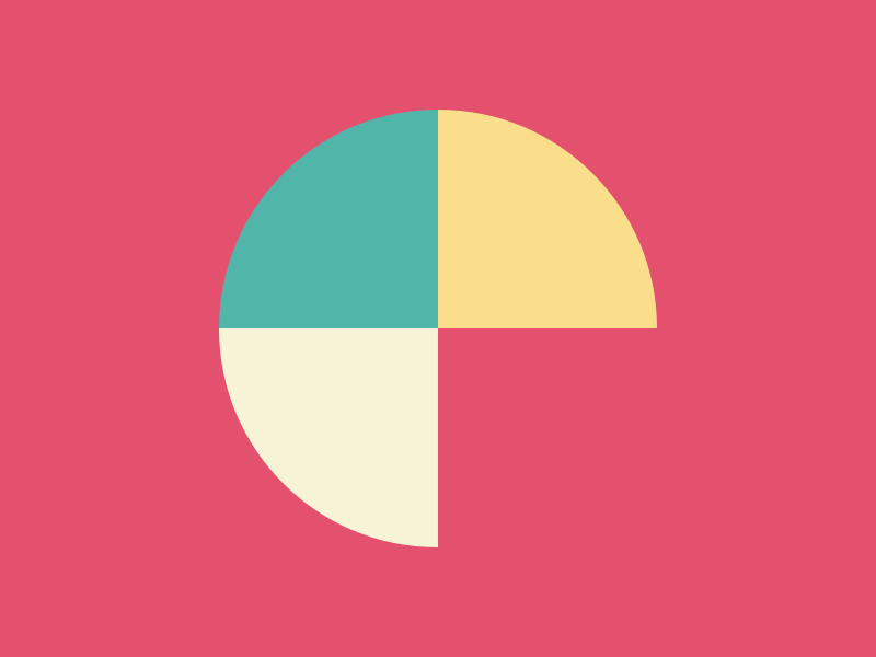
This one is a combination of two tricks we already learned: border-radius and
grid. So I’ll keep it short: first I added the 3 slices, like so:

Then changed each slice with a different color and border radius to match the
target, and put the in a grid container. Sounds simple now, but I didn’t have
a chance to do this 6 targets ago! 😅 I’m getting better at this!

The code:
<div class="g">
  <div class="slice a"></div>
  <div class="slice b"></div>
  <div class="slice c"></div>
  <div class="d"></div>
</div>
<style>
  body {
    background: #E3516E
  }
  .g {
    width: 200px;
    aspect-ratio: 1;
    position: absolute;
    inset: 0;
    margin: auto;
    display: grid;
    grid-template-columns: 1fr 1fr
  }
  .slice {
    width: 100px;
    aspect-ratio: 1;
  }
  .a {
    background: #51B5A9;
    border-radius: 100% 0 0 0;
  }
  .b {
    background: #FADE8B;
    border-radius: 0 100% 0 0;
  }
  .c {
    background: #F7F3D7;
    border-radius: 0 0 0 100%;
  }
</style>
Target #7: Leafy Trail
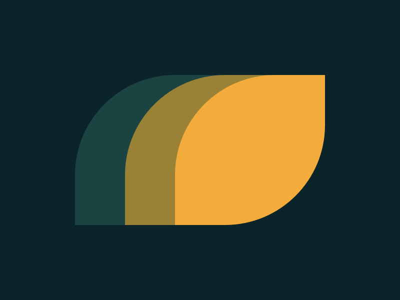
Same things we already saw: border-radius and absolute positioning. I’ll
keep it short, here’s the code:
<div class="co">
  <div class="leaf a"></div>
  <div class="leaf b"></div>
  <div class="leaf c"></div>
</div>
<style>
  body {
    background: #0B2429;
  }
  .co {
    width: 250px;
    height: 150px;
    position: absolute;
    inset: 0;
    margin: auto;
  }
  .leaf {
    position: absolute;
    inset: 0;
    width: 60%;
    height: 100%;
    border-radius: 66.66% 0 66.66% 0
  }
  .a {
    background: #1A4341;
  }
  .b {
    background: #998235;
    margin: auto;
  }
  .c {
    background: #F3AC3C;
    left: 40%
  }
</style>
BTW, here’s the “minified” version for the Code Golf element:
<div class="co"><div class="l a"></div><div class="l b"></div><div class="l c"></div></div><style>
.co,.l{position:absolute;inset:0}.b,.co{margin:auto}body{background:#0b2429}.co{width:250px;height:150px}.l{width:60%;height:100%;border-radius:66.66% 0}.a{background:#1a4341}.b{background:#998235}.c{background:#f3ac3c;left:40%}</style>
Target #8: Forking Crazy
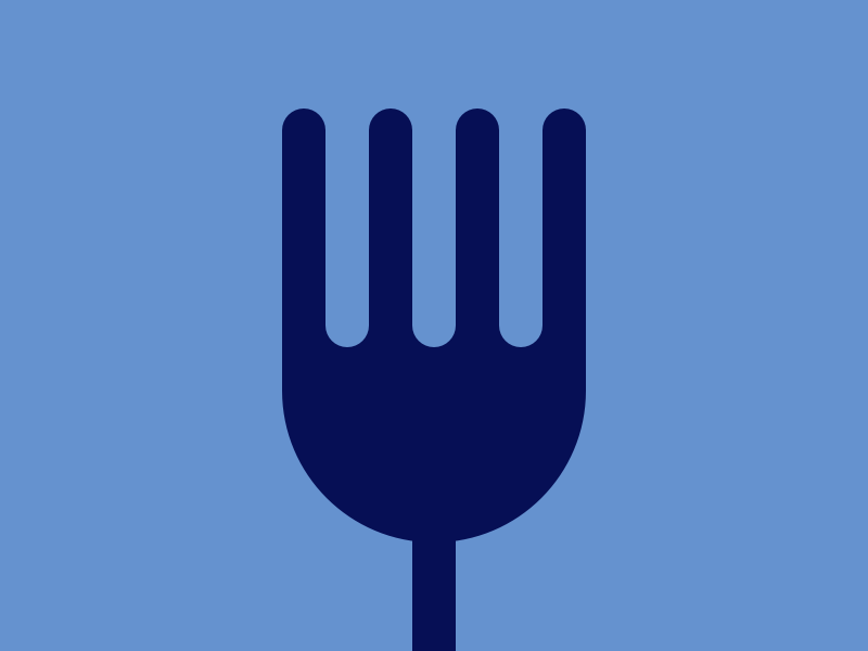
No idea! Let’s give it a shot. I started with the pole. Then I thought about how to make the fork. I started with a debug container, and then a single tine, without a border radius yet.

Then I decided to use grid with two (uneven) rows and 7 columns. The first row
was where I added the other tines and untines. By the way, untine is a word I
just made up. It’s a tine that’s not a tine. It’s pronounced:

After adding the border radius, I realized I needed to debug the untines as well to see them before adding the body. So here they are in all their lime-y glory 🍋

Finally, I need to add the fork’s body. I changed the layout around a bit: Now it’s a grid with three rows. The first row is the tines, the second connects the tines to the fork body, and the third is the fork body. Then I added color for the connector and the body, border radius-ed the body, and…

See the problem?

To fix it I played around with a few solutions, all of which broke the fork
completely, until I found
this StackOverflow question.
Phew! The missing area was filled with a box-shadow.
Here’s the code:
<div class="pole"></div>

<div class="fork">
    <div class="tine"></div>
    <div class="untine"></div>
    <div class="tine"></div>
    <div class="untine"></div>
    <div class="tine"></div>
    <div class="untine"></div>
    <div class="tine"></div>
    <div class="body-tines-connector"></div>
    <div class="fork-body"></div>
</div>

<style>
  body {
    background: #6592CF
  }
  .body-tines-connector {
    background: #060F55;
    grid-column: 1 / 8;
  }
  .fork {
    width: 140px;
    height: 200px;
    position: absolute;
    inset: 0;
    margin: auto;
    display: grid;
    grid-template-columns: 1fr 1fr 1fr 1fr 1fr 1fr 1fr;
    grid-template-rows: 55% 5% 40%;
    overflow: hidden;
  }
  .tine {
    background: #060F55;
    border-radius: 10px 10px 0 0;
  }
  .untine {
    background: #6592CF;
    border-radius: 0 0 10px 10px;
    box-shadow: 0 10px #060F55;
  }
  .pole {
    width: 20px;
    height: 1000px;
    position: absolute;
    left: calc(50% - 10px);
    top: 60%;
    margin: auto;
    background: #060F55;
  }
  .fork-body {
    background: #060F55;
    grid-column: 1 / 8;
    border-radius: 0 0 100px 100px;
  }
</style>
This one was definitely the hardest, and I’m sure that there is a way to simplify it.
Target #9: Tesseract
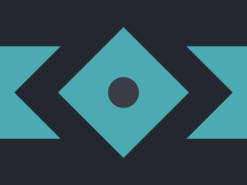
Let’s start with the background rectangle. I positioned it in the center
vertically using calc, which IMO makes the code very readable - instead of a
magic number in the end it shows the work process along the way and how I “got”
to that number.
  .rect {
    width: 100%;
    height: 150px;
    position: absolute;
    left: 0;
    top: calc(50% - 75px);
    background: #4CAAB3;
  }
Then I need to add a skewed rectangle. For this we need to learn about the
transform property
in CSS. It’s a very powerful property, but we just need to rotate 45 degrees,
using transform: rotate(45deg);:

From there it was a simple process of adding another “diamond” and a circle: things we already know how to do from previous steps. Here’s the code:
<div class="rect"></div>
<div class="centered diamond r2"></div>
<div class="centered diamond r3"></div>
<div class="centered circle"></div>
<style>
  body {
    background: #222730
  }
  .rect {
    width: 100%;
    height: 150px;
    position: absolute;
    left: 0;
    top: calc(50% - 75px);
    background: #4CAAB3;
  }
  .centered {
    position: absolute;
    inset: 0;
    margin: auto;
  }
  .diamond {
    aspect-ratio: 1;
    transform: rotate(45deg);
  }
  .r2 {
    background: #222730;
    width: 250px;
  }
  .r3 {
    background: #4CAAB3;
    width: 150px;
  }
  .circle {
    background: #393E46;
    width: 50px;
    aspect-ratio: 1;
    border-radius: 100%;
  }
</style>
As you can see, for code reuse, I split it into a few classes, some of which are re-useable:
centered- positions the element in the centerdiamond- makes the element a diamond (by rotating it 45 degrees)
Target #10: Cloaked Spirits
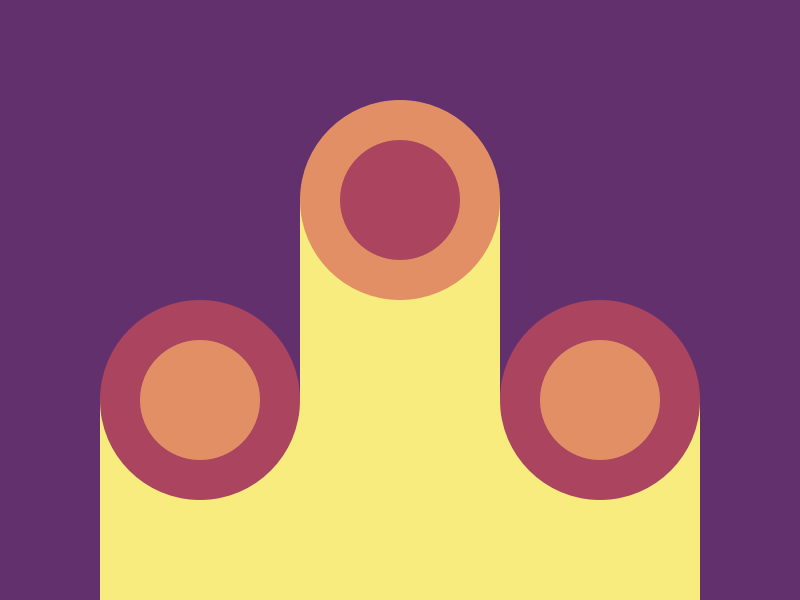
This one… Was a bit annoying, honestly. Perhaps there’s an intelligent way to solve it with tools I just don’t know yet, but I ended up using a ton of absolute positioning and “magic” const values, and since the shape is so irregular and complex, I’m not sure how to make the code make more sense.
Since this stage wasn’t so much about the code, I didn’t work on re-useability
or anything like that, I just wanted to get it done. So here’s the code and
honestly there isn’t a ton to explain if you know how to use
position: absolute:
<div class="container">
  <div class="rect1"></div>
  <div class="rect2"></div>
  <div class="circle-1 red">
    <div class="circle-1-inner orange"></div>
  </div>
  <div class="circle-1 top orange center-hor">
    <div class="circle-1-inner red"></div>
  </div>
  <div class="circle-1 red right">
    <div class="circle-1-inner orange"></div>
  </div>
</div>
<style>
  body {
    background: #62306D;
  }
  .container {
    position: absolute;
    bottom: 0;
    left: 50px;
    width: 300px;
    height: 250px;
  }
  .red {
    background: #AA445F;
  }
  .orange {
    background: #E38F66;
  }
  .circle-1 {
    aspect-ratio: 1;
    width: 100px;
    position: absolute;
    top: 40%;
    border-radius: 100%;
  }
  .circle-1-inner {
    aspect-ratio: 1;
    width: 60px;
    position: absolute;
    inset: 0;
    margin: auto;
    border-radius: 100%;
  }
  .right {
    right: 0;
  }
  .top {
    top: 0;
  }
  .center-hor {
    left: 100px;
  }
  .rect1 {
    background: #F7EC7D;
    width: 300px;
    height: 40%;
    position: absolute;
    bottom: 0;
  }
  .rect2 {
    background: #F7EC7D;
    width: 100px;
    height: 80%;
    position: absolute;
    bottom: 0;
    left: 100px
  }
</style>
Summary
There are two more targets in this battle, but I’m out of time for today, and I think I got the point. They also look super hard 😅
I’m getting better at this, and it was a fun way to spend a few hours. Check out my CSS Battle profile here.
I’m not sure if I’ll continue with this series: but I feel like I understand this part of the job better now, which should help me manage FE devs better and perform better FE code reviews.